Sanel Selimovic

Wend Care was designed as a comprehensive mobile application aimed at assisting recent graduates in navigating medical certification programs and job opportunities within their locale. My role focused on enhancing user experience through refined program search functionalities, job matching capabilities, and user profile management. Throughout the project, I developed an extensive design system and tailored the app to cater to specific fields, namely nursing and dental programs, enabling users to compare, discover, and apply to programs directly through the app.
Project Date
2023
Project Type
iOS
Client
Occam Education
As a UI/UX Designer for Wend Care, I was entrusted with the comprehensive design of the application, from conceptualizing the user journey to crafting a cohesive design system. My responsibilities included creating a broad array of design assets to support the dual focus on nursing and dental programs. I played a pivotal role in developing a user-friendly interface that simplified program searches, facilitated effective job matching, and streamlined profile management, directly contributing to a seamless user experience.

Program Search: Design a user-friendly search and filter system that helps recent graduates easily find medical certification programs based on their location and preferences.

Job Matching: Develop a job board feature that connects certified graduates with relevant job openings in their field, streamlining the job search process.

User Profiles: Create profiles that highlight graduates' qualifications, certifications, and skills, making it easier for employers to find suitable candidates.

The primary challenges in developing Wend Care revolved around three key areas: program search, job matching, and user profile management. The app aimed to serve recent graduates seeking certification in nursing and dental fields, necessitating a highly intuitive and efficient platform. The complexity of categorizing and presenting diverse programs and job opportunities in a user-friendly manner, coupled with the need for effective user profile customization, posed significant design and usability hurdles.

User Testing

Design Handoff

Customer Interviews

Design System

UI & UX Design

Interactive Prototyping
This figure presents an overview of the project's lifecycle, illustrating the phased approach from initial market research through to the development stage. It encapsulates the meticulous process undertaken to ensure that each step, from wireframing to UI design and the establishment of a style guide.


Wend Care aimed to streamline the transition for recent graduates into the medical field by simplifying the discovery of certification programs and job opportunities in nursing and dental sectors. Our objectives focused on enhancing program search and job matching functionalities, improving user profile management for a seamless application process, and ultimately driving user engagement and adoption. The overarching goal was to position Wend Care as the go-to platform for healthcare career development.
The creation of the Information Architecture (IA) was a foundational step in the design process, serving as a strategic blueprint that guided our design thinking. By mapping out the app's structure, we were able to visualize and plan the user journey, ensuring a seamless and intuitive navigation experience.


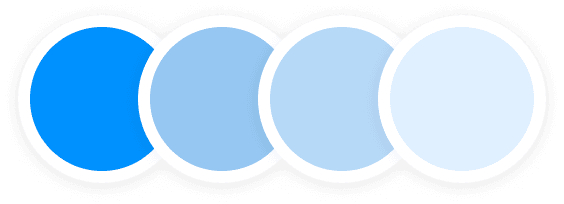
Professional Sky
Professional Sky instills a sense of aspiration and growth, aligning with the app's goal to assist medical professionals in advancing their careers through relevant certifications and continuous learning.

Healthcare Sage
Healthcare Sage was chosen to project a knowledgeable and reputable image, illustrating that the app serves as a trusted guide for healthcare practitioners seeking recognized job certifications aligned with industry expertise.

This visual showcase features key elements like buttons, input fields, and information cards, each meticulously designed to enhance usability and maintain brand consistency across the platform.


Benjamin has recently graduated from medical school and is eager to start his career in the healthcare field. He's looking for certification programs that will enhance his skills and increase his job prospects. Benjamin values platforms that provide clear information about medical certification options and job opportunities.

Emily has been working as a nursing assistant for a few years and is considering furthering her career by pursuing additional certifications. She's looking for a platform that offers flexible certification options and connects her with job openings in her local area. Emily values platforms that provide convenience and career growth opportunities.
User interviews were crucial in tailoring our UI design to meet the specific needs and expectations of SoFi Invest's users. These conversations provided direct insights into user preferences and pain points, guiding us to develop an intuitive, user-centered interface that truly resonated with our audience.


The launch of Wend Care marked a significant milestone in addressing the needs of recent graduates in the medical field. By offering a tailored solution that segmented nursing and dental programs, the app provided an invaluable tool for comparing educational programs and uncovering job opportunities. The design system I implemented ensured a consistent and engaging user experience, facilitating ease of navigation and application processes. The successful deployment of these features greatly enhanced the platform's utility, making it a crucial resource for graduates aiming to kickstart their careers in healthcare.
Dan Brown
Entrepeneur
Sanel is an outstanding designer, always eager to educate clients on best UX/UI principles, and great at implementing the same. He’s a true professional: great grasp of Figma, excellent communication skills and a gift at thinking of the user.
© 2026 Sanel Selimovic
¿Why is a raven like a writing desk?